Mobile devices dominate Internet access, so it is vital that web developers adapt their sites to offer an optimal mobile experience. With the increased use of smartphones and tablets, users expect web pages to load quickly and be easy to navigate on any device. This article will explore the importance of responsive web development, addressing best practices and the benefits it brings to both users and businesses. In addition, it will provide a complete guide on how to implement it effectively, including tools and techniques that can facilitate the adaptation process.
What is Responsive Web Development?
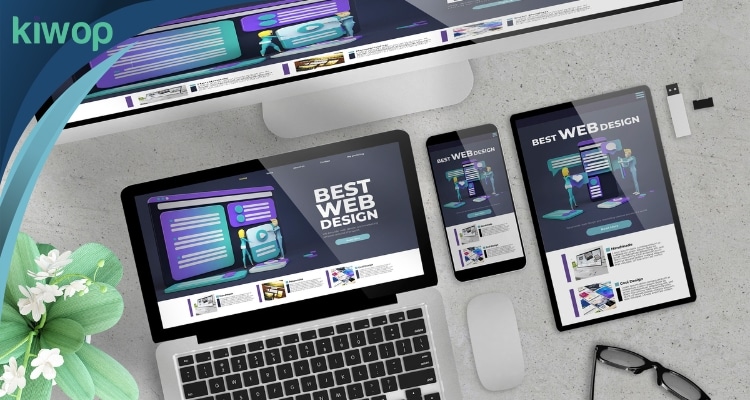
Responsive web development is a design technique that allows a website to automatically adjust to different screen sizes and devices. From smartphones to tablets to desktops, the goal is to deliver a consistent and enjoyable user experience regardless of the device used. This approach involves the use of technologies such as HTML5, CSS3 and JavaScript, which allow the content and design of the website to be flexible and adaptable.
Importance of Mobile Adaptation
As the use of mobile devices continues to grow, users expect websites to look and function well on their phones and tablets. Not having a tailored site can result in a high bounce rate and a decrease in time spent on the page, negatively affecting the overall performance of your site. In addition, a non-responsive website can offer a poor user experience, which could damage your brand's reputation and lead to a decrease in conversions and sales.
Benefits of a Responsive Website
A responsive website not only improves the user experience, but also simplifies site maintenance. Instead of managing multiple versions of a site for different devices, a responsive approach allows for a single optimized design. This facilitates updates and ensures that all users, regardless of the device they use, have access to the same information and functionality.
Relevant Statistics
According to recent studies, more than 50% of Internet searches are conducted on mobile devices. In addition, search engines such as Google prioritize responsive websites in their ranking algorithms. This data underscores the need to adopt a responsive web development approach. Companies that invest in responsive web design not only improve their visibility in search engines, but can also increase user retention and improve their conversion rates, leading to overall growth in their business.
Key Principles of Responsive Web Design
To achieve a truly responsive web design, it is crucial to follow certain principles and best practices. Here we present the most important ones, with a little more detail to help you better understand each of them.
Fluid Grids
Fluid grids allow the elements of a web page to be sized proportionally rather than using a fixed size. This flexible approach ensures that elements automatically adjust to the size of the screen. By using percentages instead of pixels, fluid grids make it easier for content to rearrange and adjust harmoniously across different resolutions and device sizes, providing a consistent user experience.
Flexible Imaging
Make sure that images can be resized without losing quality. It uses CSS techniques such as `max-width` and `height:auto` to ensure that images fit correctly within their containers. In addition, consider using responsive images that change their resolution based on the device, thus optimizing loading time and visual quality. Tools such as `srcset` and `sizes` attributes in HTML allow you to define different versions of an image for different scenarios, improving site efficiency and performance.
Media Queries
Media queries are CSS rules that allow you to apply specific styles according to the characteristics of the screen, such as its width, height, resolution and orientation. This method is essential to adapt the design to different devices and resolutions. Media queries allow you to create breakpoints in your design, where you can adjust layout, font sizes, images and other elements to look and function optimally on any device, from cell phones to high-resolution desktop monitors.
Incorporating these principles into your design process ensures that your website is not only visually appealing, but also functional and accessible to a diverse audience, regardless of the device they use to navigate.
Tools and Technologies to Implement Responsive Design
There are several tools and technologies that facilitate the implementation of responsive web design, allowing sites to adapt to different screen sizes and devices. Here are some of the most popular and effective ones.
Bootstrap
Bootstrap is a widely used CSS framework that facilitates the creation of responsive designs through a series of predefined components and a flexible grid structure. Bootstrap's popularity lies in its ease of use and the wide variety of resources and documentation available, making it an ideal choice for beginners and experienced developers alike.
CSS Frameworks
In addition to Bootstrap, there are other CSS frameworks such as Foundation and Bulma that offer similar functionality. These frameworks help streamline the development process and ensure consistency in design. Foundation, for example, is known for its flexibility and customization, while Bulma is appreciated for its simplicity and modern design.
JavaScript Libraries
Libraries such as jQuery Mobile and React.js provide additional tools and components for creating responsive and dynamic user interfaces. These libraries complement CSS and provide advanced functionality. jQuery Mobile facilitates the creation of mobile applications with a consistent user interface, while React.js enables the development of reusable components and the efficient management of application state.
Media Queries
Media queries are a fundamental technique in responsive design that allows different CSS styles to be applied depending on device characteristics, such as screen width. This technique is essential to ensure that the design adapts correctly to mobile devices, tablets and desktop computers.
Testing and Simulation Tools
Finally, to ensure that the responsive design works correctly on all devices, it is important to use testing and simulation tools such as BrowserStack and Responsinator. These tools allow developers to verify how their website looks and behaves on a variety of devices and screen resolutions.
Implementing responsive design is crucial in modern web development, and using the right tools and technologies can make this process more efficient and effective.
Impact on User Experience and Performance
Implementing responsive web design not only improves the appearance of your site on different devices, but also has a significant impact on the user experience and overall performance of your site. In an increasingly mobile world, where users access the internet from a variety of devices such as smartphones, tablets and desktop computers, having a website that adapts to all of these platforms is crucial.
Improved User Experience
A responsive design ensures that users have a smooth and efficient browsing experience, which can increase user satisfaction and loyalty. Users value ease of use and accessibility when browsing the Internet. In addition, a responsive website can reduce user frustration by avoiding the need to zoom or scroll horizontally to read content. This creates a more intuitive and comfortable experience, increasing the likelihood that users will stay longer on your site and return in the future.
Increased Performance
A responsive website can also improve performance by optimizing resource usage. By adapting content to different devices, you can reduce loading time and improve speed, which are crucial for retaining visitors. Image optimization, deferred loading and efficient use of caching are some of the practices that can be implemented in a responsive design to significantly improve performance. Faster load times not only improve the user experience, but also reduce bounce rates and increase conversions.
SEO implications
Google and other search engines prefer responsive websites, as they provide a better user experience. This can improve your rankings in search results, attracting more organic traffic and increasing your site's visibility. In addition, a responsive design facilitates content management, since it is not necessary to create multiple versions of the same site for different devices. This efficiency not only saves time and resources, but also ensures that all users receive a consistent, high-quality experience, regardless of the device they use. Implementing responsive design can also contribute to better performance in Google's core metrics, such as Core Web Vitals, which focus on the loading speed, interactivity and visual stability of a page.
Case Studies of Successful Responsive Web Sites
Examining examples of websites that have successfully implemented responsive design can provide valuable insight into best practices and the benefits gained. Here are a few case studies that show how responsive design can transform the user experience and generate positive results.
Case 1: The Boston Globe
The Boston Globe was one of the first sites to adopt responsive design. In doing so, they were able to deliver a consistent user experience across all devices, from desktops to smartphones and tablets. This implementation not only improved content accessibility, but also resulted in higher reader retention and a marked improvement in advertising revenue. In fact, its innovative approach has been cited on numerous occasions as a pioneering example in the field of web design.
Case 2: Starbucks
Starbucks implemented a responsive design that allows users to easily navigate and place orders from any device, be it a cell phone, tablet or laptop. This adaptation has significantly improved customer satisfaction by providing a seamless and uninterrupted shopping experience. In addition, it has led to an increase in online sales, as users can place orders conveniently and quickly. Starbucks' strategy has demonstrated that well-executed design can have a direct impact on commercial success.
Case 3: TechCrunch
TechCrunch, a popular technology news site, adopted a responsive design to handle its large volume of content. With the implementation of this design, they not only improved the reading experience by making the content more accessible and easier to navigate, but also increased their traffic and engagement. Users can now access articles and news from any device without having to sacrifice reading quality. This has established TechCrunch as a leading source of technology information, attracting more readers and increasing their loyalty.
In conclusion, these case studies highlight the importance of responsive design in today's digital age. The benefits go beyond aesthetics, directly impacting user retention, revenue and customer satisfaction.
Common Challenges and How to Overcome Them
Responsive web development can present several challenges. Below, we discuss some of the most common and effective strategies for overcoming them.
Resource Optimization
Ensuring that resources such as images and scripts are optimized can be a challenge. High resolution images can slow down page loading, so using techniques such as lazy loading and image compression is essential to improve performance without sacrificing visual quality. In addition, minification of CSS and JavaScript files can reduce file size and speed up loading time.
Cross-Browser Compatibility
Ensuring that your site works perfectly in all browsers can be tricky, as each browser may interpret the code differently. Use tools such as BrowserStack to perform extensive testing and ensure compatibility across multiple platforms. It is also useful to familiarize yourself with the differences between browsers and adjust your code accordingly.
Maintenance and Upgrades
Keeping a responsive website up to date can require ongoing effort. Implement a content management system (CMS) that facilitates updates and be sure to regularly review the performance and usability of your site. In addition, staying on top of the latest technologies and best practices in web development can help keep your site optimized and efficient. Conducting regular performance audits and acting on the findings is also crucial to ensure that the site remains fast and accessible.
Future Trends in Mobile Usage and Responsive Web Development
The future of the mobile web is constantly evolving and it is crucial to be aware of emerging trends that could influence responsive web development. Every advance in technology brings with it new opportunities and challenges for developers and designers.
Increasing Use of Mobile Devices
The use of mobile devices continues to grow at a rapid pace. With the proliferation of smartphones and tablets, more people are accessing the web through these devices. Developers must anticipate this trend and ensure that their sites are fully accessible and functional on any device, regardless of screen size or operating system. The user experience should be seamless and consistent, regardless of whether they are accessing from a cell phone, tablet or desktop computer.
Integration with AI and Machine Learning
The integration of artificial intelligence and machine learning in web development is on the rise. These technologies can deliver more personalized and efficient user experiences by dynamically adapting to user preferences and behaviors. For example, machine learning algorithms can analyze usage patterns to deliver relevant content and personalized recommendations. In addition, AI-powered chatbots can improve customer service by providing instant support and resolving common queries efficiently.
Developments in 5G Technology
5G technology promises much faster internet speeds and lower latency, which will revolutionize the way we interact with the mobile web. This will allow developers to create richer and more complex web experiences without worrying about slow load times, expanding the possibilities for responsive design. With 5G, web applications will be able to handle high-quality graphics and real-time video more easily, significantly improving the user experience. In addition, faster and more reliable connectivity will facilitate the development of applications that rely on real-time data and continuous interaction with IoT devices.
Final considerations
Responsive web development is an unavoidable necessity in today's digital environment. Offering an optimal mobile experience not only improves user satisfaction and retention, but also positively impacts your site's performance and search engine rankings.
For web developers, adopting a responsive design approach is critical to staying competitive and relevant. If you have not yet begun to implement these techniques, now is the perfect time to do so.
At Kiwop, we specialize in offering responsive web development solutions that ensure your site looks and works flawlessly on any device. If you want to improve your users' experience and optimize your website's performance, contact us today. Our team of experts is ready to help you.
Visit our website to learn more about our services and featured projects. Don't miss the opportunity to transform your website and provide an exceptional user experience and keep up to date with the latest news and trends in web development by following us on LinkedIn. On our Kiwop LinkedIn page, we share informative articles, case studies, and expert advice that can help you improve your digital strategy. Join our community and be part of the conversation about the future of web development and technology.